In a study of more than 1,000 exams, PET/MRI improved lesion detection by more than 15% compared with PET/CT in selected cancers -- namely malignant bone disease and lung cancer. In addition, PET/MRI reduced ionizing radiation by nearly 80% when compared with PET/CT.
A research team from the University of Duisburg-Essen in Essen, Germany compared PET/MRI with PET/CT in terms of lesion detection and classification for oncologic exams. They found more lesions on PET/MRI than on PET/CT, and in 15.4% of all exams, additional lesions were identified on PET/MRI that were not detected on PET/CT (Journal of Nuclear Medicine, August 2020, Vol. 61:8, pp. 1131-1136).
"PET/MRI improves lesion detection for selected cancers and potentially reduces the need for additional examinations in comparison with PET/CT," wrote co-lead authors Dr. Ole Martin from the department of diagnostic and interventional radiology at University Dusseldorf, Medical Faculty in Dusseldorf, Germany, and Dr. Benedikt Schaarschmidt from the University of Duisburg-Essen's department of diagnostic and interventional radiology and neuroradiology.
Comparing PET/CT with PET/MRI
PET/CT has become the go-to method to improve cancer staging accuracy, optimize therapy strategies, and improve patient outcome -- particularly for lung cancer and lymphoma. However, the modality has low soft-tissue contrast and emits radiation, neither of which is true for PET/MRI.
Several studies have already shown PET/MRI's effectiveness in imaging certain cancers -- notably prostate and breast -- but the lack of high-quality data regarding other cancers hinders PET/MRI's widespread introduction into clinical practice, according to Martin and Schaarschmidt. The researchers sought to remedy this problem by comparing PET/CT with PET/MRI in different oncologic diseases at their institution.
Patients underwent a whole-body PET/CT scan from skull to mid-thighs (Biograph mCT, Siemens Healthineers) followed by a whole-body PET/MRI scan (Biograph mMR, Siemens Healthineers). The patients presented with the following cancers:
- Lung cancer (17.9%)
- Gastrointestinal cancer or neuroendocrine tumors (17.2%)
- Gynecologic or breast cancer (14.8%)
- Prostate cancer (14.8%)
- Lymphoma (12.0%)
- Melanoma (8.7%)
- Head and neck cancer (8.0%)
- Cancer of unknown primary (4.3%)
- Malignant bone disease (2.4%)
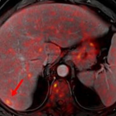
 Indeterminate lesion on PET/CT classified by PET/MRI for 53-year-old man with lung cancer. Contrast-enhanced CT (A), PET (B), and fused F-18 FDG PET/CT (C) images are displayed in comparison with contrast-enhanced T1-weighted MRI (D), PET (E), and fused F-18 FDG PET/MRI (F) images. In CT (A), hyperdense, subcentimeter liver lesion (arrows) in segment VII is suggestive of transient hepatic attenuation difference or small hemangioma. As malignancy cannot be excluded, it needs further investigation. On PET/MRI, lesion is clearly classified as metastasis because of contrast enhancement and tracer uptake due to later acquisition time point. Follow-up CT confirmed diagnosis after 78 days. Image courtesy of the Journal of Nuclear Medicine.
After exclusions, the researchers examined 1,003 PET/MRI scans of 918 patients. PET/MRI outperformed PET/CT in terms of providing more tumor information (26.3%), mostly in patients with malignant bone disease, followed by lung cancer, prostate cancer, and gynecologic or breast cancer. PET/MRI identified additional malignant findings in 5.3% of cases, which lead to a change in tumor, node, and metastases (TNM) staging in 2.9% of cases. PET/MRI also clearly classified indeterminate PET/CT lesions in 11% of cases.
A smaller percentage of lesions, 2.9%, were detected on PET/CT but not visible on PET/MRI. Of those lesions, 1.2% were malignant and led to a change in TNM staging in 0.5%. It should be noted PET/MRI missed a negligibly small number (0.8%) of lung metastases, which contradicts previous beliefs that the chest requires additional CT, the authors wrote. In addition, new MRI sequences such as ultrashort echo-time sequences are expected to improve lung nodule detection, which would also enhance the sensitivity of PET/MRI even further, they added.
An important difference between PET/CT and PET/MRI was the estimated mean effective radiation dose. It amounted to 17.6 ± 8.7 mSv for PET/CT and 3.6 ± 1.4 mSv for PET/MRI -- a reduction of 79.6%.
The radiation reduction is likely of particular interest for younger patients because the cumulative dose can be significant when considering the radiation required for staging, therapy monitoring, and aftercare using CT.
"Future studies addressing the technical and operational challenges of PET/MRI, as well as involving different vendors and even larger cohorts, will hopefully further pave the way toward a widespread introduction of PET/MRI into clinical patient care," the researchers concluded.